Light can completely change the look of your pictures. Learning to use it to your advantage is a valuable and powerfultool. Light can be used for many different effects, such as silhouettes, high contrast, to tell the eye where to look, or even to show symbolism.
The picture on the right shows the silhouette of a dog. This picture uses high contrast with the reflection of light on the floor and the darkness of the dog. The long shadow also makes the picture more interesting.
Symbolically speaking light can represent many things. The most common is hope. Therefore, by using high contrast and light, you can add an abstract thought into your pictures, making them even more meaningful.

Light can also represent the magic of life. Without life, nothing would be able to thrive and live. Light has shone down upon us since the beginning, and I mean the
beginning. So in a way, a place without light is a place without life.
The picture on the left could either be a sunrise, or a sunset, and symbolically speaking, they both mean completely different things. Can you tell whether this is a sunrise or a sunset???

The two following pictures were taken at slightly different angles, creating a completely different effect. The top one shows the power of the sun in its full grandeur. The rays of light reach far and wide with a mix of magenta and white/yellow streams of light. Being in the center and top of the picture, the effect of power is portrayed in this photo. I put this picture as my desktop background and for the first few days, simply looking at the picture was blinding!
The second photo, taken at a slightly lower angle, depicts a very different effect. This time, the light goes more to show the magic of life in a plant. It seems like light has managed to escape the bulb and is bringing life to all of the plants around. What also is interesting is that the "container" of the light is really dark, in contrast to the inside, which is full of bright light. This effect could mirror humans in a way. On the outside, they look dull, but each person has their very own light inside of them.

Finally, this picture uses soft focus to bring attention to the leaves and what is interesting is that only half of the leaves are in the light, and the other half hides in the shadows. The tips of the leaves appear to be dipped in bronze. If you think about it, the leaves can look like paint brushes. Very high contrast occurs on the uppermost right leaf. It itself is nearly white, almost glowing, and the tip of the leaf and its background are really dark in comparison. High contrast usually brings something more to your pictures, making them way more interesting to look at.


 Light can also represent the magic of life. Without life, nothing would be able to thrive and live. Light has shone down upon us since the beginning, and I mean the beginning. So in a way, a place without light is a place without life.


 I just created a silly new font and used this font on an H. So yes, the weird thing you see is an H. Yet, if you're like me and you just cannot see the H, start using your imagination to create something completely new. I see a sort of dark room with a very interesting light. I also see a sort of director's chair against the wall. (I see the picture from and elevated point of view.) So use your imagination. What do YOU see?


 Here's a little story on the history of silhouettes: Back in the day when there were few cameras, people who couldn't afford to have a picture taken or to have a portrait made for a loved one would hire someone to do a silhouette of that person. A silhouette, in case you don't know is a profile view of someone as if a very strong light shone from behind them, only leaving the outline of their face visible. So for my loved one, my dog, I made a silhouette of her. I took a picture of her, traced the edges of the face on the computer, and finally filled in the outline. This is her silhouette shown here.
 I took this picture today and thought it was very interesting on how it could express a concept if I had just gotten the right angle. (Believe me, it was quite a challenge to find that perfect angle!) The picture contrasts the lovely red flower (which just happens to be the color of life and joy) to the thorns (which happen to be gray, the color of death). There also is a dying flower on a leaf on the far right of the picture which I didn't notice as I was taking the picture. This dying flower just happens to complete the picture.
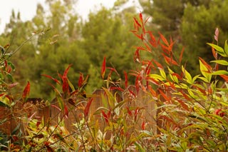
 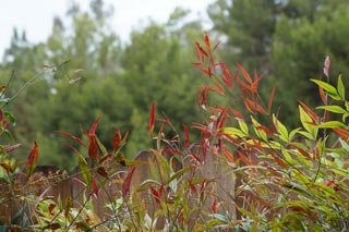 I took several pictures of the same leaves and basically only did some touch-ups on a few of them.
 The only thing I did on this one was make the colors warmer, which means to pull out the reds, oranges, and yellows in colors and make them very visible. What I like about this effect is how it almost gives the look of a sunset at times or like happy flashbacks in movies.
  Today, I learned how to make stick figures on Adobe Illustrator. Instead of using shapes, I used very thick lines to get the same look.
 I decided to change my profile picture and make it much better than the last one (which wasn't really hard to do). I drew with pencil first, and then added quite a bit of color to make it more lively. Finally, with some touch-ups done on photoshop, this picture was ready to go!


