 I took several pictures of the same leaves and basically only did some touch-ups on a few of them.
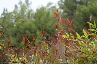
 The first one is is the normal photo without any special stuff.

This second one is obviously the exact same picture, only this time the colors are more vibrant or more saturated.
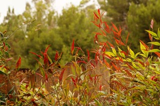 The only thing I did on this one was make the colors warmer, which means to pull out the reds, oranges, and yellows in colors and make them very visible. What I like about this effect is how it almost gives the look of a sunset at times or like happy flashbacks in movies.
 The opposite of "warm" colors is "cool" colors, which consist of mostly blue, but also some purples and darker greens. I did experiment the cool look on this picture, but it looked depressing like a stormy day. So I didn't do it. :)
I just think it's so interesting everything you can do to pictures to completely change their look or their emotional impact on the watching eyes. It's always fun to play with and a very fun way of experimenting. I definitely recommend it! So the next picture you draw, try drawing it with mostly bright colors or with mostly warm colors or even with mostly cool colors. You'll be surprised at how much your pictures communicate emotions to us way more easily!
No comments:
Post a Comment