Monday, November 11, 2013

A More Modern Look at the Thinker

I had no idea what to draw, and I guess it comes out in the drawing too.  The kid looks just as confused and thoughtful.   I did try to draw the face, but it only ended up spoiling the overall effect, even if the face is usually the most important part of a picture most of the time.  However, omitting the face can help teach how body language alone can send a message.  Ever heard of the expression, "Someone can say something, but their body language can mean the opposite?"  This is a very important part of learning how to understand humans and how to draw them.

Something I particularly like to try is drawing hands in all sorts of positions, even if most of the time, they end up as a complete failure!  : )  However, I keep trying and sometimes, it really is worth it, since sometimes, my own hand surprises me with its capabilities.

When I originally started drawing this picture, I had no intent of placing a rock there.  Yet, as it progressed, the need for a very conveniently placed rock arose.  So I ended up drawing it.  : )

Saturday, November 9, 2013

Imagination

. . .

I have no idea what I was thinking while doing this.  I just let the pen tool guide me. . .

What do you think??? :)

(By the way, the green thing is supposed to be a paint brush.) :)

Playing with Light

Light can completely change the look of your pictures.  Learning to use it to your advantage is a valuable and powerfultool.  Light can be used for many different effects, such as silhouettes, high contrast, to tell the eye where to look, or even to show symbolism.

The picture on the right shows the silhouette of a dog.  This picture uses high contrast with the reflection of light on the floor and the darkness of the dog.  The long shadow also makes the picture more interesting.

Symbolically speaking light can represent many things.  The most common is hope.  Therefore, by using high contrast and light, you can add an abstract thought into your pictures, making them even more meaningful.  

Light can also represent the magic of life.  Without life, nothing would be able to thrive and live.  Light has shone down upon us since the beginning, and I mean the beginning.  So in a way, a place without light is a place without life.  

The picture on the left could either be a sunrise, or a sunset, and symbolically speaking, they both mean completely different things.  Can you tell whether this is a sunrise or a sunset???


The two following pictures were taken at slightly different angles, creating a completely different effect.  The top one shows the power of the sun in its full grandeur.  The rays of light reach far and wide with a mix of magenta and white/yellow streams of light. Being in the center and top of the picture, the effect of power is portrayed in this photo. I put this picture as my desktop background and for the first few days, simply looking at the picture was blinding!


The second photo, taken at a slightly lower angle, depicts a very different effect.  This time, the light goes more to show the magic of life in a plant.  It seems like light has managed to escape the bulb and is bringing life to all of the plants around.  What also is interesting is that the "container" of the light is really dark, in contrast to the inside, which is full of bright light.  This effect could mirror humans in a way.  On the outside, they look dull, but each person has their very own light inside of them.

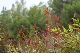
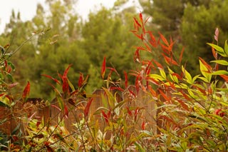
 Finally, this picture uses soft focus to bring attention to the leaves and what is interesting is that only half of the leaves are in the light, and the other half hides in the shadows.  The tips of the leaves appear to be dipped in bronze.  If you think about it, the leaves can look like paint brushes.  Very high contrast occurs on the uppermost right leaf.  It itself is nearly white, almost glowing, and the tip of the leaf and its background are really dark in comparison.  High contrast usually brings something more to your pictures, making them way more interesting to look at.

Monday, July 22, 2013

What Could Be Hiding Inside That Hat???


I don't know about you, but this man looks real grouchy, but the hat seems full of power...

Thursday, July 18, 2013

Starry Night


There is a little kid looking up at the fantastic sky that night and at all the shooting stars.

Let Your Imagination Run WILD!!!

I just created a silly new font and used this font on an H.  So yes, the weird thing you see is an H.  Yet, if you're like me and you just cannot see the H, start using your imagination to create something completely new.  I see a sort of dark room with a very interesting light.  I also see a sort of director's chair against the wall.  (I see the picture from and elevated point of view.)  So use your imagination.  What do YOU see?

Mystical Forest

Our assignment was to create a design that portrayed several emotions and feelings or just one.  I'll let you decide for yourself which feeling is associated with this image.

Actually, this image looked really flat and boring until I decided to put a gradient as the background.  What I like about this gradient is how it makes you feel that even if you're in this forest that might frighten you, the light (or white) gives you hope and courage and you no longer believe that the dots and swirls are or bad magic.

Wednesday, July 17, 2013

The Reach

The first thing you might notice is how the picture took the two sides of the sketchbook.  That was simply bad planning.  If you're thinking, "Well, is that second arm really necessary?"  Yes it is.  Try picturing it without the arm.  It would give a completely different sense to the image.  Anyway, I'm most proud of the cloth since I usually draw terrible cloth.  :)


The Sheriff


He will be watching...

Monday, July 15, 2013

Searching For Butterflies

Here are two pictures of a lovely butterfly resting on a rose.  


For this picture to look this way, I took out all the colors except for red.  So the roses are definitely bright red and surprisingly, the orange butterfly didn't show much red on it.  Either way, the butterfly pops out even more in this picture because of the bright red surrounding it.  If the flowers weren't red, the butterfly would have been harder to find and it would also have been harder to find the shape of this butterfly.  If I told you there was a second butterfly in the leaves, you wouldn't be able to find it.  The red also draws attention to a rose hidden behind the foliage that, without the red being exposed would hardly be noticeable.

Friday, July 12, 2013

A Middle Earth Sign Assignment

Hobbit Crossing
We were assigned to design signs that could go into the world of Middle Earth.  We first had to come up with thirty ideas, then make fifteen thumbnails for the best fifteen, narrow those fifteen down to about five, make those five bigger and neater, and finally make the best ones on the computer.  Here are a few that I came up with.

This first one is supposed to help protect hobbits from being run over since they're so small!


No Smoking


Because there are no cigarettes in Middle Earth and the inhabitants use pipes, this pipe replaces the cigarette on the traditional sign.

Making Silhouettes

Here's a little story on the history of silhouettes:  Back in the day when there were few cameras, people who couldn't afford to have a picture taken or to have a portrait made for a loved one would hire someone to do a silhouette of that person.  A silhouette, in case you don't know is a profile view of someone as if a very strong light shone from behind them, only leaving the outline of their face visible.  So for my loved one, my dog, I made a silhouette of her.  I took a picture of her, traced the edges of the face on the computer, and finally filled in the outline.  This is her silhouette shown here.

Thursday, July 11, 2013

Representing Lessons Through Images

I took this picture today and thought it was very interesting on how it could express a concept if I had just gotten the right angle.  (Believe me, it was quite a challenge to find that perfect angle!)  The picture contrasts the lovely red flower (which just happens to be the color of life and joy) to the thorns (which happen to be gray, the color of death).  There also is a dying flower on a leaf on the far right of the picture which I didn't notice as I was taking the picture.  This dying flower just happens to complete the picture.

So a lesson we can learn from this picture is how beautiful things may have hidden thorn, and huge ones too!  This lesson closely relates to "Don't judge a book by it's cover."  It's usually stuff like this that makes a picture very meaningful and in some cases, unforgettable.  So to look for lessons to insert into some pictures
is also a very important thing to learn and master.

Playing with Leaves

I took several pictures of the same leaves and basically only did some touch-ups on a few of them.

The first one is is the normal photo without any special stuff.


This second one is obviously the exact same picture, only this time the colors are more vibrant or more saturated.


The only thing I did on this one was make the colors warmer, which means to pull out the reds, oranges, and yellows in colors and make them very visible.  What I like about this effect is how it almost gives the look of a sunset at times or like happy flashbacks in movies.

The opposite of "warm" colors is "cool" colors, which consist of mostly blue, but also some purples and darker greens.  I did experiment the cool look on this picture, but it looked depressing like a stormy day.  So I didn't do it.  :)

I just think it's so interesting everything you can do to pictures to completely change their look or their emotional impact on the watching eyes.  It's always fun to play with and a very fun way of experimenting.  I definitely recommend it!  So the next picture you draw, try drawing it with mostly bright colors or with mostly warm colors or even with mostly cool colors.  You'll be surprised at how much your pictures communicate emotions to us way more easily!


Learning to Make Stick Figures!

Today, I learned how to make stick figures on Adobe Illustrator.  Instead of using shapes, I used very thick lines to get the same look.

What I was trying to get across, if it wasn't obvious already was to show one person running, and another playing golf.  Something I learned for these silhouettes is to use as little or even no overlapping parts.  It just happened that both places where the golfer went wrong is where the arm overlaps the body and where the legs overlap each other. Oops.  :)

New Profile Picture!

I decided to change my profile picture and make it much better than the last one (which wasn't really hard to do).  I drew with pencil first, and then added quite a bit of color to make it more lively.  Finally, with some touch-ups done on photoshop, this picture was ready to go!

A Dancer Rehearsing

The title pretty much says it all. :)

A Mysterious Eye


What I could, and should have done to make this picture better was to have drawn more reflections and add to her eye to make it more interesting.  I did try using some shading for the nose and the side of the ear that we can see to give a more three dimensional look.

Little Red Riding Hood/Big Bad Wolf Exercise

Triangle Little Red Riding Hood
Here is a really cool exercise to try out!  You will need to draw three Little Red Riding Hoods and three Big Bad Wolves.  However, each model will need to have one made of only circles, one made of only rectangles, and another made of only triangles.  So you'll end up with three completely different Little Red Riding Hoods, and three completely different Big Bad Wolves.  I drew a Little Red Riding Hood out of triangles.

Triangle Big Bad Wolf
This exercise teaches you how to play with shapes and see the personalities of shapes too.  For example: Would you be more afraid of a Big Bad Wolf made out of circles or triangles?  Which Little Red Riding Hood would you find most friendly looking?  The one out of circles, or the one out of rectangles, or the one out of triangles?

Playing with "The"


These "the"s were done on Adobe Illustrator and can show you just how fun it can be to play with even the simplest word and contort it into many different fashions.

Tuesday, July 9, 2013

From Camera to Pencil

This illustrated flower is based on the pink one below.

This exercise is great for people who want to perfect their drawing skills.  Just pick any picture you want to illustrate and draw away!

Learning to draw a colored object with only a pencil is good practice too.

For the shading, I used a technique called smudging which gives your art a softer look than crosshatching, another way to draw shading.  

Removing a Color From RGB

Only the color blue is visible.  All other colors were eliminated.
 The effects on these images can be done using photoshop and are always mind-blowing!

Here, only green is shown, leaving the sky a lonely gray.

Gray Skies

This picture was taken just before sunset on a cloudy day (obviously).

Flowers


This first photo was taken with a soft focus which means that one part of the image is in focus while the rest is slightly blurry.


Here is a red rose, also taken in soft focus.  The rose is in focus and the bougainvillea behind is slightly blurry.  Another element which brings focus to the rose is the contrast of bright to dark.  The light on the leaves near the rose are much more brightly lit than the leaves near the bougainvillea.  Our eyes are also drawn to bright colors.  The rose is in very vivid colors, but we are also drawn to look at the background because of the magenta colors of the bougainvillea.  


Monday, July 8, 2013

Fist

Ka-Pow! :)

Even with no shading, this image is strong and powerful.  So even simple line drawings can evoke something strong in you!  The only technique I used a little to give a sense of 3D is how some lines are thicker and heavier than others to give the impression of shadow

Light Through the Window


I've been pondering what to name this piece and thought maybe "Comet Emerging From Sun Breaking Glass Into Shards".  But that's far too long, tedious and boring, and not as fun as "The Super Strong Light Shone From the Sun and Broke the Glass Window".  Yet that too is FAR too long.  So we'll just have to do with a pleasant "Light Through the Window" which can't stand it so it shatters.